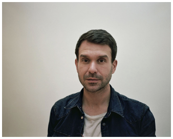
Slinkachu, or Stuart Pantoll was born in 1979 in Devon, UK, is a small scale street artist from London, who attempts to portray the loneliness big cities can have, whilst still having some comedic value through the use of the miniature figures.
Some of his work may have been inspired by his childhood, as his dad bought him a train set which included multi miniature figures, which interested him. On his website, it states “His work embodies elements of street art, sculpture, installation art and photography and has been exhibited in galleries and museums globally.” His images relate to them because they are little people living in a bigger world, which realistically represents what humans are to the universe which allows us to think all small our events are in the greater scheme of things.
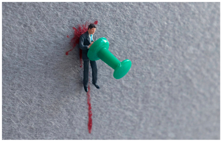
When I encountered this photograph I was particularly interested why he decided to leave such a large amount of negative space, which can sometimes make an image look empty, but in this shot, it actually highlights how minimal the character’s death is compared to the rest of the world.
I am going to try and replicate this technique in my own images. In this photograph, I can see a man pinned to the wall, with blood dripping down. The photographer’s use of contrasting colours gives the image a more joyful tone, which is juxtaposed with the saddening scene, which results in the image being more complex and dynamic.

In this shot, I can see some youths drinking and an old woman cleaning up their mess. This could portray how nowadays the elderly are subservient, which is highlighted by the fact she is cleaning up others mess.
Slinkachu’s images inspire me because of how he uses normal-sized items and incorporates them into his minimal images, by conveying them as a different object, in this case, it’s a bottle taking the role of a meeting spot.
In this shot, the rule of thirds has also been used well, as its one third subject matter and two thirds negative space, which makes the image look more aesthetic to the eye. Slinkachu has also used a shadow depth of field to capture the different textures from the characters, the floor and the bottle and different tones.

Once again, Slinkachu has used normal day items and portrayed them as a completely different object, in this shot, the shoelace represents the Loch Ness Monster and the bottle cap portrays a boat for the two sailors.
In this shot, Slinkachu must have used a fast shutter speed, because the shot was taken at day, meaning if he used a slow shutter speed lots of the natural sunlight would enter the camera, resulting in the image being overexposed, which would strip it out of almost all tonal values and textures.
The photo is also taken on water, which allows the photographer to capture mirrored reflections from the subject matter, which makes it more aesthetically pleasing.
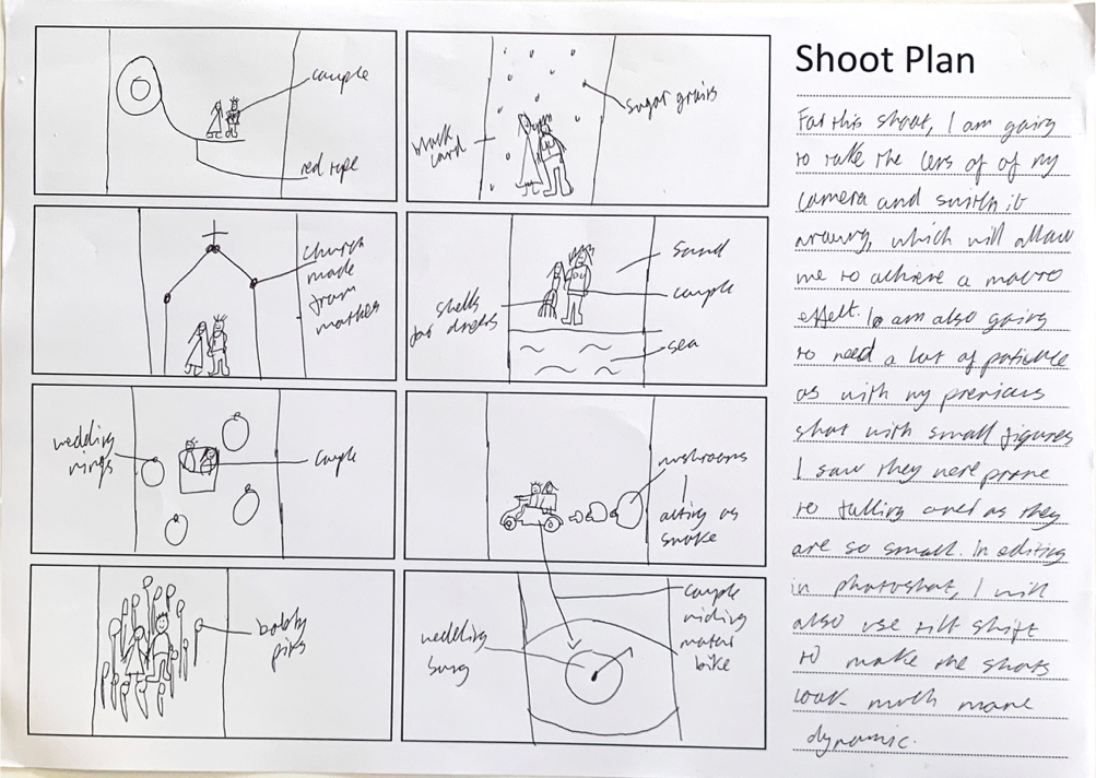
[SHOOT PLAN]
[1/60, F4.5]
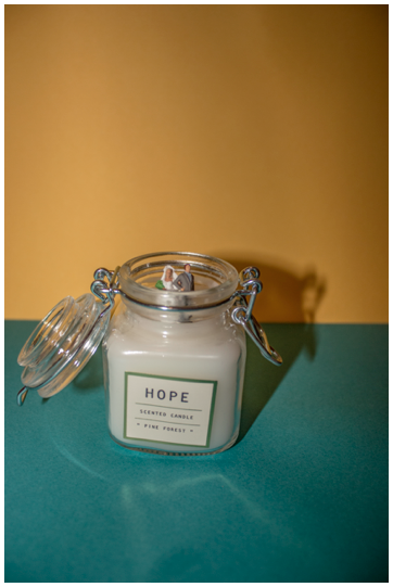
This image is of two lovers standing in the middle of a candle. I think this image has a deeper meaning in that they are standing in a place where fire occurs, which can show the uncertainty of marriage because fire can provide for people, however, it can also be destructive which are some aspects of getting married.
I also chose a candle that said “hope” on it which can portray how they are wishful their marriage will succeed.
One issue that I faced with this image was the strange reflections coming from the glass as I was using flash. I tried not using it and it lost a lot of the textures.
Overall I think this is my least favourite shot form this shoot because I don’t really like the composition as the angle I took the shot at makes the framing look not very aesthetic.
[1/60, F4.5]

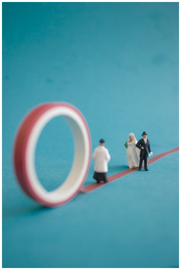
This photograph is of a couple walking down the aisle, which was taken in my house. I used a blue background because it represents trust and loyalty which are two key themes of marriage. I also used the red tape to act as the aisle.
I was trying to show how marriage can be precarious, by having a thin aisle which can represent a tight rope, which is hard to stay on, which could imply nowadays marriages are harder to sustain.
This photo relates to Slinkachu because of how I used a shallow depth of field to highlight the different textures and tonal values from the figures.
I am particularly pleased with how I edited the image, by making it look quite bleak to show how the glamour of marriage is juxtaposed with the potential of divorce, which often ruins peoples lives.
In order to improve this photograph, I could have made sure the tape was straight throughout the whole line, which would make the shot look more professional.
[1/60, F4.5]

This image is of a married couple, which I took in a small studio I set up in my house. I positioned multiple rings around them to reinforce the theme of marriage.
I was trying to convey how although marriage is good and joyful, it may lead to a sense of entrapment because of your partner, which is represented through circular rings, which are inescapable. However, the rings could also portray how marriage is an agreement between two families for financial benefit.
This image relates to the photographer because of the large amount of negative space I used to convey the minimalism of marriage in comparison to the world.
I am happy with how I used the torch on my phone to subtly add some soft shadowing on the different subject matters, which makes the overall shot more dynamic.
Whilst setting up this shot I struggled placing the couple in the ring without them tipping them over, I overcame this by putting a small amount of glue on the bottom of them.
[1/60, F4.5]

This photograph is of a married couple, which was taken in my house. I tried to make it look like a beach by having the sky with the blue card and the sand with the yellow card.
I was attempting to portray how although the event of a couple getting married is massively important to them, in the greater scheme of things it’s irrelevant compared to bigger events such as their environment. I aimed to represent this by leaving lots of negative space to show how minimal they are.
This photo relates to the photographer because of how I used a shallow depth of field to highlight the different textures and tonal values from the figures.
I am particularly pleased with how I edited the image, by making it look quite bleak to show how the glamour of marriage is juxtaposed with the potential of divorce.
In order to improve this photograph, I could add a textured overlay on top of the image to make it more dynamic.
[1/60, F4.5]

This image is of a married couple, which I took in a studio I set up in my kitchen. I arranged the mushrooms in such a way they look like smoke, I was inspired by the photographer to do this as it portrays everyday objects as something part of a miniature world.
This image relates to the photographer because of the vast amount of negative space, which highlights how minimal they really are.
I am pleased with the composition I used in this shot because I have used the rule of thirds appropriately, as one-third of the shot is the subject matter and the rest is negative space which gives the shot breathing space, resulting in it looking nicer.
When I took this shot, I struggled with focusing my camera on the characters, because they are so small, it is very hard to get it right, but with time I managed to focus it correctly.
[1/60, F4.5]
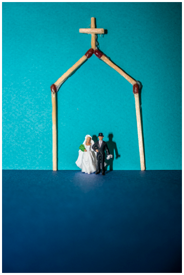
This shot is of a married couple underneath a church altar. I used the matchsticks to show a couple getting married as finding their “perfect match.”
This image relates to the photographer because of the large amount of negative space I used to convey the minimalism of marriage in comparison to the world.
Whilst taking this image, I struggled with making the arch stand up by its own, but I ended up just propping it up against the background. However, I think it would look better if I managed to stand it up on its own as it would look more three dimensional,
If I were to retake this shot, I would try and glue the matches together more carefully to remove the smudges, which would make the overall shot look more aesthetically pleasing.
[1/60, F4.5]

This image is of a couple that are ‘Just Married’ on a motorbike, riding around a record track. I specifically chose the song “If You Wanna Be Happy” by Jimmy Soul because it tells you not to marry a pretty woman when a bride on her wedding day is typically the day in her life when she is most radiant.
The cyclical shape of the records could imply that marriage is just one part of a greater cycle in life, that keeps ongoing. I like the colours I have used in this shot, that’s paired with the sepia overlay to give it a rustic mood. I used a shallow depth of field for this shot because I could capture the textures from the record and the couple. I also really like the composition of this shot, as I have used one third subject matter and the other two-thirds are negative space which balances out the image.
[EXPERIMENTATION]

In this image I added a sepia overlay in the hue and saturation section, this removes most of the colouring from the image, which thus focuses the viewer on other aspects such as the subject matter.
In this image I added an old-style overlay in the hue and saturation section, this makes them look more rustic which emphasises an older timer period, it could also show how marriages break down just like the photo has worn out.