
Robert Capa (Endre Friedmann; 22 October 1913 – 25 May 1954) was a Hungarian war photographer and photojournalist. He worked alongside his companion and professional partner, photographer Gerda Taro.
Many consider Capa to be the most famous war photographer in history. This is partly down to controversy, extensive combat photography and the way he died.
Born in Budapest, he felt the political oppression of the time, forcing him to flee to Berlin. Here, he saw the rise of Hitler, which led him to move to Paris. It was in Paris that he met and began to work with Gerta Pohorylle. She changed her name to Gerda Taro. He changed his name to Robert Capa, a name he picked up from his ‘shark’ tactics in street photography. They both published work under his name until her name change, then her work was published separately.
Robert Capa covered five wars. The Spanish Civil War, the Second Sino-Japanese War, World War II across Europe, the 1948 Arab–Israeli War, and the First Indochina War. His images found themselves across the globe, published in magazine and newspapers.
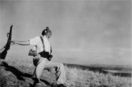
This image was published in a life magazine in 1937 captioned as “A Spanish soldier the instant he is dropped by a bullet through the head”. The key reason why this image has such emotional value is because of the event occurring in it of sudden death. The moment of death occurs inevitably in everyone but is unusually captured.
Another reason why this image is so powerful is due to the dramatic use of the rule of thirds, by leaving two thirds the negative space. The use of black and white in this image reinforces the saddening mood. The use of shallow depth of field focuses on the man dying which shows how the event of death during the war is minor yet its effect is tightened and of uppermost importance to certain people, like his family.
For this shoot, I have been inspired by the theme of war and the miniature figures from my last shoot inspired by Slinkachu, thus my images will be of miniature soldiers.
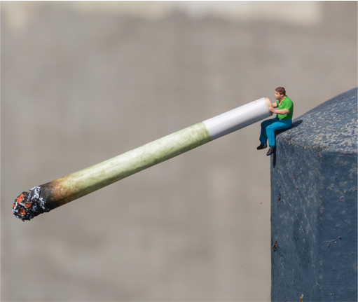
This image is by Slinkachu, and is of a miniature figure smoking a cigarette.
The use of a large amount of negative space indicates their lack of importance, this theme is juxtaposed by the image above which is obviously very important. This image was taken outside and uses natural lighting from the sun, hence the bright colouring which gives the image an optimistic mood. In this shot, a shallow depth of field has been used to capture more textures from the cigarette and tonal values.
This image inspires me because of the way Slinkachu incorporated normal items into a miniature world, which is what I aim to do in my next shoot combining the two themes of miniature figures and the saddening theme of war.
[SHOOT PLAN]

[1/200, F8]

This image is of three soldiers, taken under a park bench. Although the surroundings of this photo don’t match with the image, I think it is still aesthetically pleasing to look at because of the leading lines, caused by the rays of sunlight through the bench.
For this shot, I used a shallow depth of field to focus the soldier’s textures and tonal values, paired with the natural lighting to enhance the shadowing.
The light rays from the sun can always represent the glimmers of hope that occur in the event of war,
If I were going to try and improve this image I would add some war context to make it look more realistic
[1/125, F6.3]
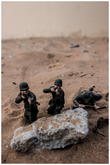
This photo is of some soldiers in the desert, hiding behind some rocks, which act as a barrier of protection for them.
One thing I would like to change about this image is the upper part of the background, because it brings real-world context into the shot, thus making it look less realistic.
Despite the background, I am happy with the angle I took this photograph at because it allows you to see more of the body of the soldiers whereas if I took it horizontal to the floor you would only be able to see their heads.
I like the juxtaposition between the light sand colouring and the dark soldiers, which could indicate how depressing war is.
[1/125, F6.3]
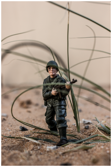
This photo is of a soldier in the desert holding a gun, with some grass in front of the subject matter.
Although this shot has an unorthodox composition, I think because of the angle I took it at, it still holds aesthetic value.
To improve this shot I could have positioned the grass better so that its more vertical instead of horizontal, which I think would make it look more dynamic.
I think this shot is gripping because the soldier looks very young, which addresses the issues propaganda played in the war, where it glamourised it to make younger people want to sign up.
[1/125, F6.3]
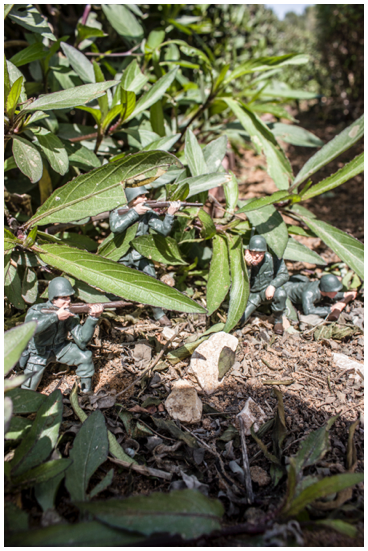
I took this image in a bush outside of my house, it’s of soldiers hiding behind foliage in a park and was taken during the day.
I am frustrated with the shadowing in the bottom part of the frame because it removes from the mood and ditches a dramatic element from the shot.
I could have decreased the brightness in this image to make it look more saddening and depressive as they are in a war.
I am pleased with the composition of this image as its very aesthetic, but I should have focused on more of the soldiers to capture more detail.
[1/30, F3.5]

For this shot, I placed the soldiers in some fencing that was on its side, which gives the illusion of some sort of hideout in war. I am pleased with the positioning of the figures in this image because they look quite natural, my favourite character is the one in the middle whom I managed to place inside the structure.
I think one of the reasons this is a good image is because the negative space is also interesting, due to its complex structure and varied tonal values and textures.
When taking this shot I took multiple variations with different focal points on different characters and I think this was the best one because I managed to focus on two of them.
To improve this photograph, I could try and strip it from its brightness and colour to make it look more saddening.
[1/200, F8]

This photo is of a soldier hiding in a tree, talking on a walkie talkie. I positioned him here because the tree has a green tint, thus making it appear like he is attempting to be in camouflage.
I have captured some interesting shadowing in this image, through the use of natural lighting.
If I were to retake this shot, I would change the location of the plant so that there isn’t anything distracting in the background, to make it look more authentic.
I used a shallow depth of field in this image to focus on the subject matter and capture lots of tonal values and textures.
[1/200, F8]
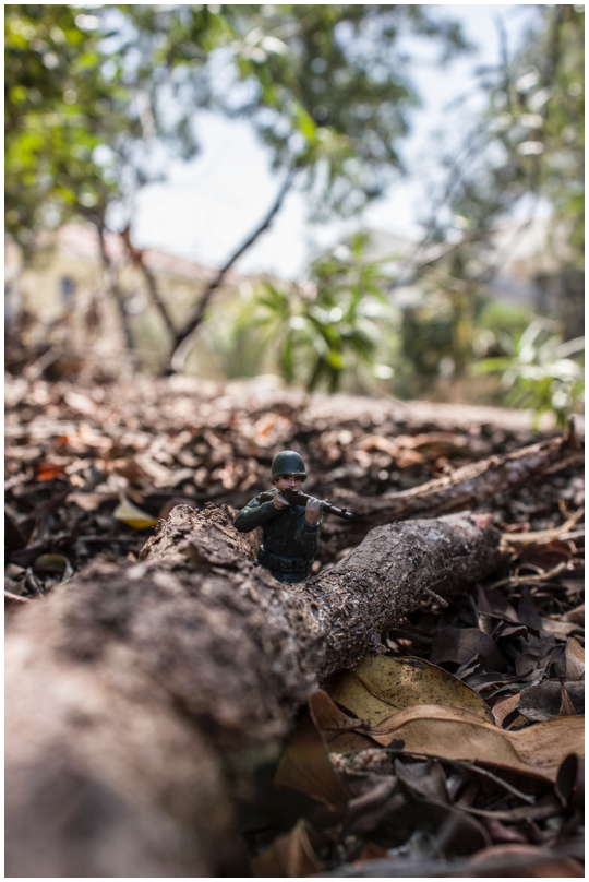
Personally, this is my favourite image from the shoot, because of how I positioned the soldier and portray the tree as a barrier for him. I am also pleased with the different textures I managed to capture from the leaves and the tree, through the use of a shallow depth of field. The tree also acts as a leading line towards the main subject matter of the soldier.
In the editing process, I always increased the clarity to enhance the tonal values, which in turn makes the image look more dramatic. I think that although I used an unorthodox composition, as I didn’t use the rule of thirds, it still looks pleasing on the eye. If I were to try and improve this image, I would consider editing out the houses in the back or retaking the shot from a different angle to ensure they weren’t present, which would make the image much more gripping.
[EXPERIMENTAL]


In these images, I have added a textured overlay to give them a more rustic look and enhance the old mood. This makes the images look like they were from an older time period, like World War One or World War Two as coloured images were not available, or very limited